ProVision
Illustration, Packaging Design
Contact lens packaging



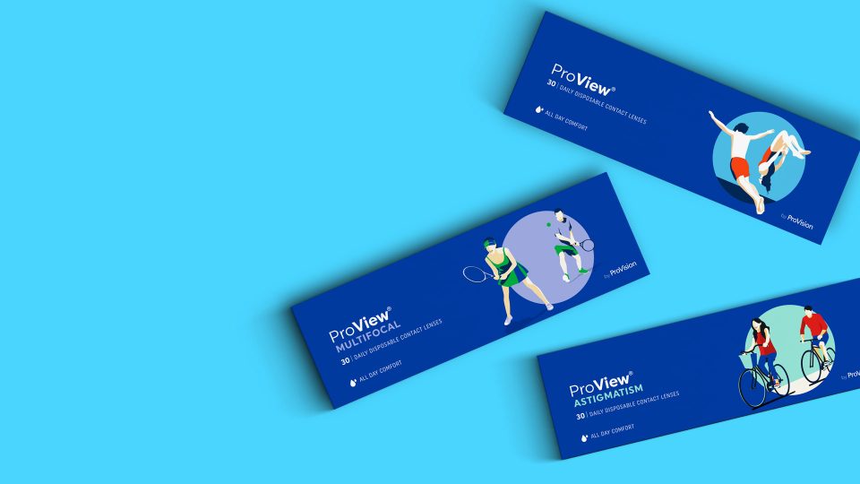
ProVision – the largest network of independent optometrists in Australia has asked us at Boxer to redesign their range of contact lenses. Their aim was to create a product different to the competitors with modern packaging that focuses on the consumer rather than the product’s medical properties.
Being a contact lens user myself I found this to be a dream brief – swapping my glasses for contact lenses has given me the ability to enjoy things I wasn’t able to do before. I worked closely with the client and our strategic team to establish the perfect positioning for the brand – ‘feel the freedom’.
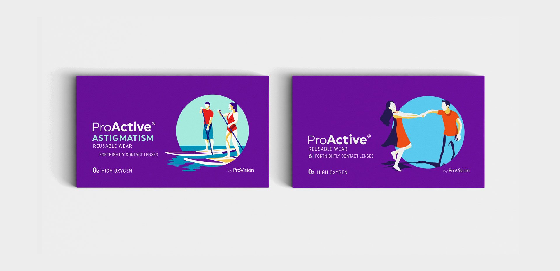
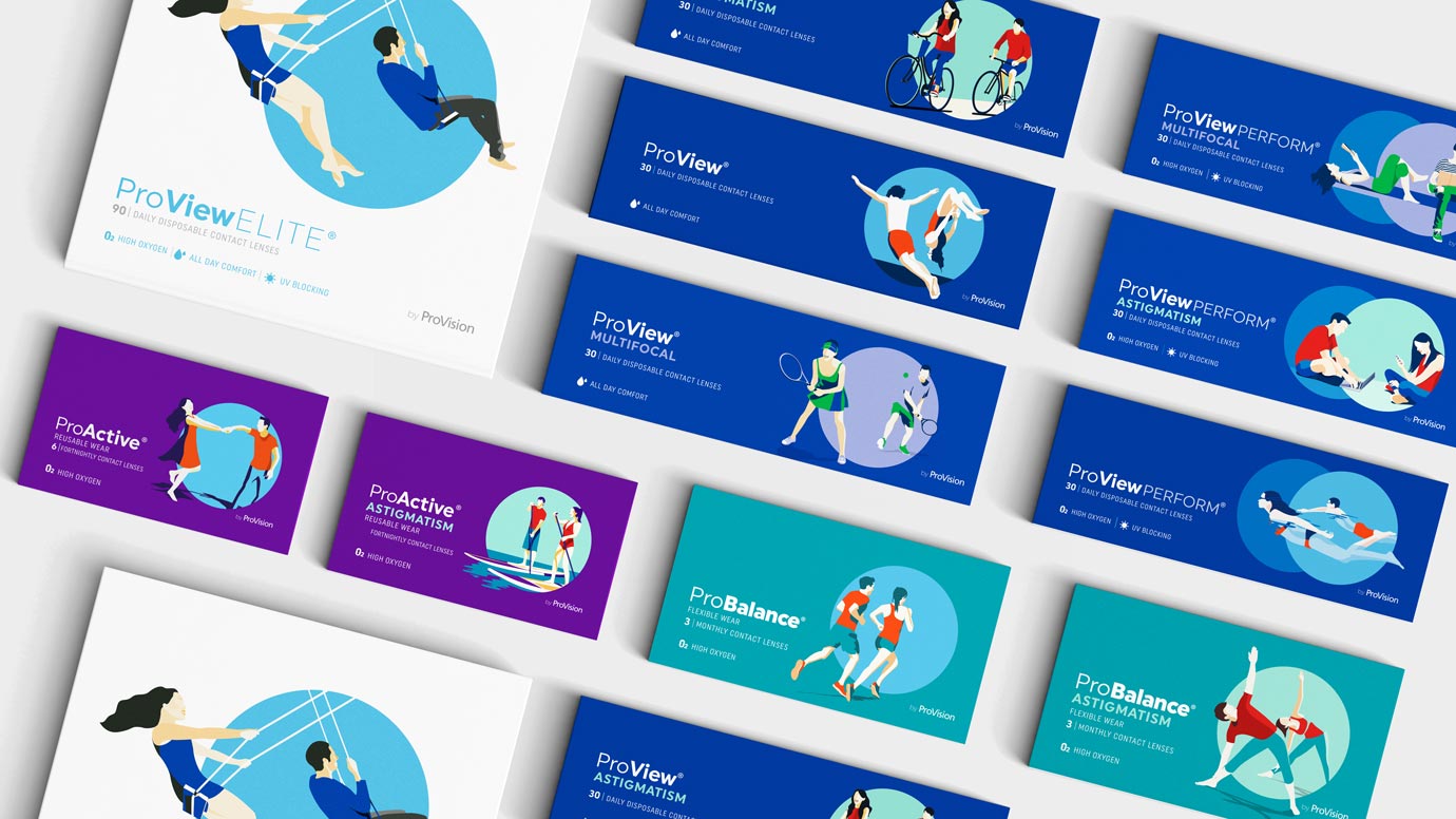
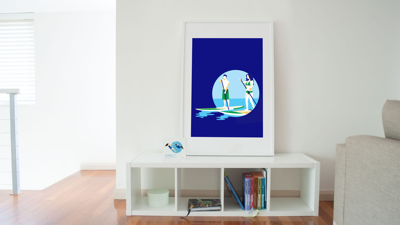
I’ve created a simple system using a circle graphic representation of the contact lens, highlighting the freedom this products gives you. Each pack features a different activity scene in a modern take on 1950’s illustrations. To ensure a clear navigation a simple colour system has been used throughout the packs.
The result, packs that are completely different from the sea of science and water splashes typical in this category. ProVision makes you feel empowered to enjoy life’s every wonderful moment.
Designed at Boxer & Co.
Love it?get in touch

